User Centered Design:
Link Light Rail Application
This group project was completed as part of an undergraduate course in User Centered Design, in Spring 2016.
My roles:
-
Conduct user research
-
Help formulate personas
-
Map out initial sitemap
-
Complete lo-fi prototype
-
Creation of annotated wireframes
Our group decided to develop an interactive collection of activities users can engage in on their phones, the results of which are displayed either on large displays in stations, or in the Link Rail tunnels themselves.

Initial Research & Interviews
Questions for light rail users
How often do you use light rail?
Why are you getting off at this station?
How familiar are you with the area?
Are the light rail stations easy to navigate?
Where are you coming from? Why here?
If you didn’t use the light rail, what would you have used today?
Why do you use the light rail over other modes of transportation?
What did you do during your ride today?
Can you give an example of a bad experience you had with the light rail?
User 1
-
Use light rail rarely
-
Trying to go shopping
-
Familiar with landmarks (shopping mall, Pike Place)
-
If they didn’t use the light rail, they would’ve taken the bus
-
No bad experience so far
User 2
-
Use light rail Mon-Fri
-
Trying to get home
-
Fairly familiar with area
User 3
-
Coming from UW
-
Wanted to go downtown sightseeing
-
Not really familiar with area (specifically: what’s at what stop)
-
Complaint: people that sit on the outer seat instead of moving into an open window seat
-
Meeting with friends
User 4
-
Getting off to eat dinner with family
-
Use light rail because it is convenient (but thinks that they could have just used a bus as well)
-
During ride: mostly just sat, phone didn’t work
User 5
-
Use the light rail regularly
-
Familiar with first stops & seatac, but not a lot in the middle
-
Goes to school at Seattle U, works downtown
-
Stations are fairly easy to navigate
-
Typically either bus or drive
-
Complaints: not enough seating, sometimes there are delays
User 6
-
In a rush
-
Coming from the UW, thinks they got off on wrong stop
-
Was trying to use google maps but it didn’t work in tunnel
User 7
-
Just finished shopping
-
Headed to Capitol Hill, going home
-
Light rail is okay to navigate
-
Would have walked but it looked like it might rain
User 8
-
Has used the light rail maybe 7 or 8 times
-
Usually drives but her car is in the shop
-
Transferring to a bus
-
Lives around the area
User 9
-
Coming from work
-
Getting shopping done at Japanese Grocery Store (Uwajimaya) before going home
-
Familiar with the area
-
Would usually drive to get groceries but they forgot to buy them earlier
-
Use light rail because it’s fast & you don’t have to transfer most of the time
User 10
-
Bad experience: someone on the bus before they got off was talking on their phone really loudly
-
Waiting for light rail to go to UW (is a student)
-
During ride they were listening to music on their phone
-
Pretty familiar with the area
-
Maybe 3rd time using the light rail
-
Usually take the bus only
User 11
-
Used light rail once or twice
-
Running errands for mom
-
Familiar with the area
-
Would rather drive, but didn’t want to be in traffic
-
During ride: ate some snacks, played on phone a little

Affinity diagramming for user interviews
Subcategories
-
Physical station confusion
-
Layout questions
-
Machine/technical questions
-
-
Devices
-
Headphones
-
Phones
-
-
Convenience/efficiency
-
Easy & fast
-
-
Knowledge of area
-
Unsure of destination
-
Increase features
-
Information wanted
-
Ticketing
Persona
The persona we created is a fictional character whose aspects and qualities stem from the research we did when observing and talking to people around the light rail. In order to create the persona, our group did affinity diagramming and separated our research into organized groups based on similar qualities. We then took the most prevalent and large groups of information and condensed them into a persona for our project.
By using the persona as a representation of our users, we are then able to base our design concept ideas on their wants and needs. With our persona in mind, our design objectives can target the large range of people we observed and interviewed while still being directed towards the details of a single, fleshed out “user”. Creating a persona influenced our work by providing a more human representation of the research notes we had jotted down previously.
The persona relates to our research findings because we extrapolated many of their characteristics from our field research. With our research findings, we used affinity diagramming to organize our raw data into more cohesive themes. With these themes, we were able to base our persona’s goals and traits on generalized users from our research. Some goals and traits of the persona were even taken directly from the interviews we conducted. In the case of our persona Chris, almost all of his profile is based off of our research with only a few assumptions mixed in to make him seem more dimensional.

We created the sitemap to help organize the various screen ideas we had thought up for our phone application design. When creating the sitemap, it was important to take into consideration the information that the users see as each screen progresses. As we planned an organized our sitemap, we discussed which screens were more important in the hierarchy of information for the user and we adjusted the amount of steps taken to get to each screen accordingly.
The sitemap relates to our paper prototypes because it acted as a template for our prototype to expand from. Many of our first sketches for our paper prototype came from the sitemap. Since the sitemap labeled general headings of what should be on each page, our paper prototypes went more in depth on the visuals and connections between each screen.
Sitemap

Original Sitemap
Problems with original sitemap
-
Too one-dimensional
-
Did not give many screen options
-
-
Repetitive username sign in
-
Necessity of choosing destination is unclear
-
Is it necessary for the games?
-
Revised Sitemap

 |
|---|
 |
 |
 |
 |
 |
 |
 |
 |
 |
 |
 |
 |
 |
 |
 |
 |
 |
 |
 |
 |
 |
 |
 |
 |
 |
 |
Prototypes
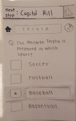
Initial Sketch Prototype Mockup
User Testing Feeback
Unintuitive
-
Some buttons have unclear navigatio
-
"Next stop" feature is not intuitive to click on
-
Readability is compromised in sketches
Additional Features
-
Would be nice to view old artwork and quotes
-
Going to homepage does not provide user with feedback from last page
-
Suggestion for ability to slide left/right between scores of different games
Overall Confusion
-
Full options for color wheel not shown
-
Puzzle game is confusing to use
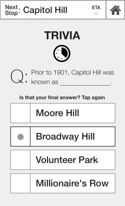
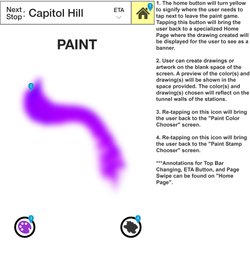
Hi-fidelity Digital Prototype Mockups
 |
|---|
 |
 |
 |
 |
 |
 |
 |
 |
 |
 |
 |
 |
 |
 |
 |
 |
 |
 |
 |
 |
 |
 |
 |
 |
 |
 |
 |
 |
 |
Changes Made
-
Changed whole app from drawings to digital
Top notification
-
Another button that says “Set ETA”
-
Maybe adding a way to have app automatically remember you or the stops you get off at if you are a frequent user
-
Distinguish top notification as something user can actually touch
Trivia
-
“Is that your final answer? Tap again”
-
Automatically begin next question when time runs out
Puzzle
-
Automatically show if submission is correct/incorrect answer when filled out, possibly add pause button?
-
Having different puzzles available
Thoughts
-
Place to save submissions
-
Maybe called something else? “Thoughts”, “journal”, etc.
Paint
-
Change from three colors to a color gradient
-
Switch from dots of color on display to a brush stroke
-
Added stamp options
-
Place to save drawings
Home page
-
Sliding to see different scores of games
Annotated Hi-Fi Prototype
 |  |  |
|---|---|---|
 |  |  |
 |  |  |
 |  |  |
 |  |